Blog PostMastering Spring Prompts: An Interview with Expert Packaging Designer Leon
- AI
- Technology
- Design
Bryony CarragherMarch 26, 2025 - 7 min read
Wing Chan, CEO and co-founder of Sourceful, sat down with Leon Tacke, a professional graphic designer who's worked with numerous AI tools throughout his career. Leon has been instrumental in co-developing the latest version of Spring as one of our earliest Design Partners. Leon has crafted some of the most successful prompts in Spring, and today he's sharing his secrets to help you create stunning packaging concepts in record time.
Meet Leon: Packaging designer and Spring design partner
Wing: Leon, thanks for joining us today. Can you tell us a bit about why prompt writing matters so much in Spring?
Leon: Absolutely. Prompt writing has quickly become an essential skill for designers using AI tools. With Spring, your prompt isn't just a description – it's a precise creative brief that guides the AI.
Think of prompt writing as another design skill in your toolkit. Just as you carefully select typefaces and colours, you need to thoughtfully choose your words to get the best results.
What's great about Spring is that it understands packaging terminology, so industry terms like "soft-touch matte finish" or "debossed lettering" directly influence your design outcomes. The right words deliver better concepts, faster.
Leon's 7-step process for perfect Spring prompts
Wing: You've developed a step-by-step approach for writing effective prompts. Can you walk us through it?
Leon: Sure! I've refined this process through hundreds of prompts, and it consistently delivers great results:
1. Start with the product type
Clearly define what kind of product you're generating. This ensures Spring understands the structural requirements.
Examples I use:
- "A sleek, structured pillow box..."
- "A minimalist perfume bottle..."
Quick tip: Avoid vague descriptions like "beautiful packaging" and instead state exactly what it is.
2. Define the core aesthetic and theme
Describe the overall mood, style, and artistic direction of the design. This prevents generic results.
Style examples that work well:
- Luxury & elegant → "Soft matte tones, gold foil detailing, and refined serif typography."
- Bold & modern → "High-contrast colours, oversized typography, and abstract patterns."
- Vintage & nostalgic → "Ornate, curved typography, soft pastel hues, and textured paper finish."
- Minimalist & clean → "Muted tones, simple typography, subtle embossing, and structured design."
Quick tip: I use an adjective + design element formula to make the style clear.
✅ "A sleek, structured box with a refined, geometric pattern."
❌ "A nice box with a beautiful pattern."
3. Specify key design features
Break down the most important design elements to control how the output looks:
- Colour palette (Soft pastels, bold primaries, monochrome, muted neutrals)
- Typography (Serif for elegance, Sans-serif for modern, Hand-drawn for playful)
- Textures & finishes (Matte, gloss, embossed, soft-touch, foil details)
- Illustrations/graphics (Floral engravings, abstract shapes, hand-drawn doodles)
Quick tip: Always include specific materials or finishes to guide texture and surface detail.
4. Composition and layout
Describe how the elements interact and where they're placed on the product.
Examples that deliver great results:
- "Oversized, expressive typography dominates the front, creating a striking focal point."
- "The branding is subtly embossed in the centre, adding a tactile, high-end detail."
- "Intricate floral engravings wrap around the edges, creating an elegant border."
Quick tip: Mention if a key feature should be dominant in the design.
5. Background and lighting
Define the environment where the product should be showcased.
Examples I've had success with:
- "Set against a softly lit, neutral-toned background to emphasise its premium aesthetic."
- "Placed on a cool-toned reflective surface with dramatic lighting for a bold, modern look."
Quick tip: The right background enhances the design and creates a mood for marketing visuals.
6. Adjust for variation (optional)
When generating multiple variations, I slightly tweak one or two elements while keeping the core style intact.
Variation examples: "A structured mailer box in blush pink with deep red serif typography." "A structured mailer box in soft beige with navy serif typography."
Quick tip: Keep the core aesthetic and format consistent while only modifying colours, patterns, or small details.
Leon's winning prompt formula
Wing Chan: You've mentioned having a specific formula for crafting effective prompts. Can you share that with our readers?
Leon: Absolutely. After testing hundreds of prompts, I've developed this formula that consistently delivers great results:
[Product Type] with a [Core Aesthetic]. The design features [Key Elements], incorporating [Typography Style, Colour Palette, Textures, or Graphics]. The composition is [Layout Description], and it is set against [Background & Lighting].
This structure ensures I never miss crucial details and helps Spring understand exactly what I'm looking for. Try it with your next project – you'll be amazed at how much better your results become.
Wing: Spring also has an AI prompt enhancer feature. How does that fit with your formula?
Leon: Great point. Spring's AI prompt enhancer button is a fantastic shortcut that expands your basic ideas into detailed prompts. It adds specifics that might otherwise be missed.
Just remember, the enhancer makes educated guesses about what you want. It adds details that seem logical but might not match your exact vision. It's brilliant for exploring options or when you're stuck, but if you have specific requirements, your own precise prompt will always work best.
I often use the enhancer as a starting point, then adjust the results to match my exact needs. This hybrid approach gives me the best of both worlds - time savings plus precision.
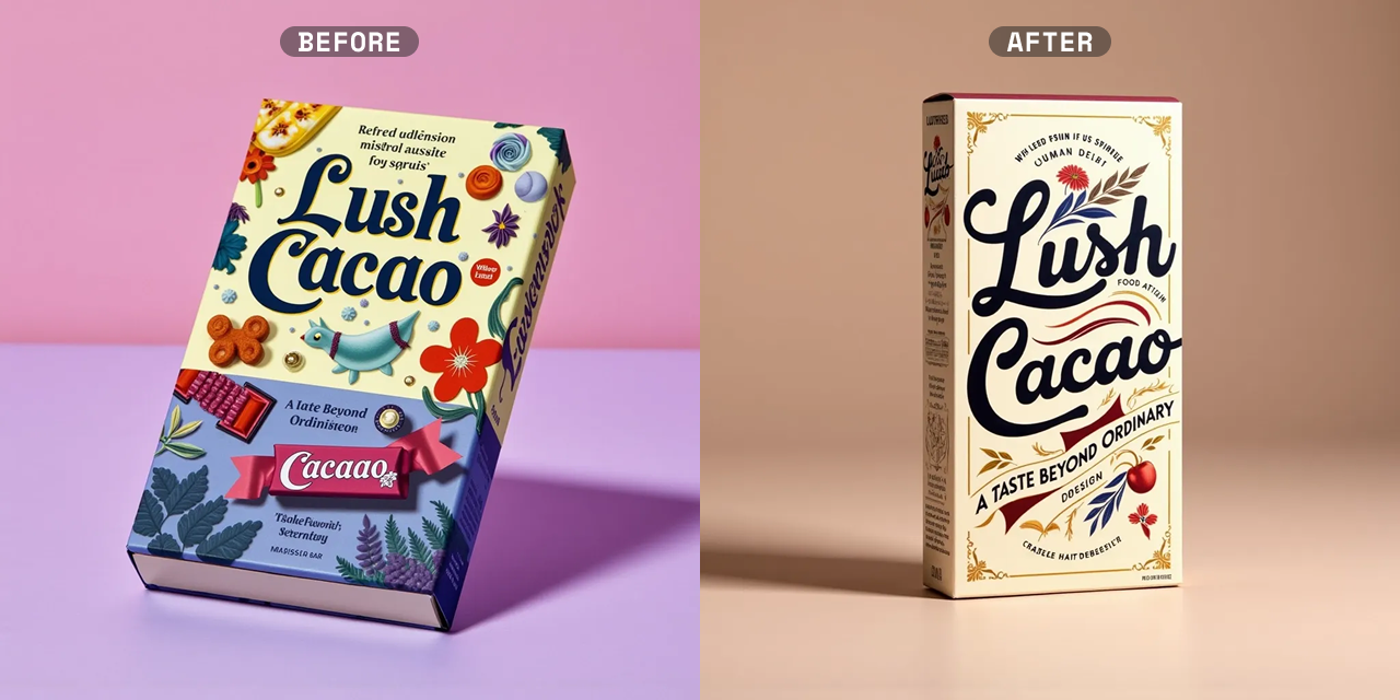
Before and after: Leon's prompt transformation
Wing: Can you show us how you'd transform a basic idea into a powerful prompt?
Leon: Here's a perfect example:
Basic idea: "A thin chocolate box with a retro style"
My improved prompt: "Retro-style chocolate bar packaging with a bold yet nostalgic aesthetic. The box features a slightly distressed ivory backdrop, contrasted by deep burgundy, caramel gold, and faded navy hues. Large, curvy typography dominates the front, framed by vintage-style banners and subtle, hand-drawn embellishments. A soft-touch paper finish with foil-stamped details enhances the artisanal appeal."
Notice how the detailed prompt gives Spring specific information about colours, typography, textures, and overall feel. The results are dramatically different.
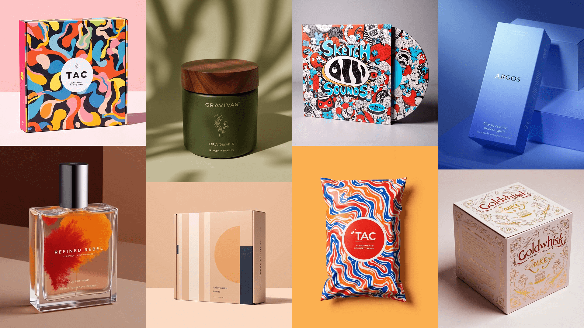
Leon's best prompt examples
Wing: You've created some amazing designs with Sourceful. Can you share some of your most successful prompts and why they worked?
Leon: I'd be happy to! Here are some of my favourites:
Argos
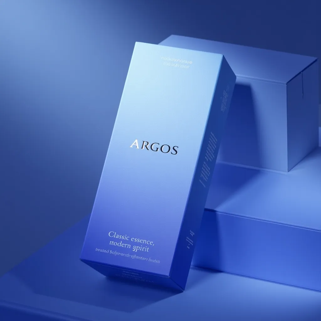
My prompt: "Elegant, minimalist carton box with a soft-touch matte finish, featuring a delicate gradient fading from deep navy to soft misty blue. The branding is clean and subtle, with debossed lettering and a refined sans-serif font. A soft glow enhances the luxurious appeal, with the background kept neutral and softly lit to emphasise the product's calming and sophisticated aesthetic."
Why it worked:
- I specified both structure and finish
- I described a specific colour transition
- I detailed typography choices
- I set the scene with lighting information
- I established a clear mood and personality
Maven & Co
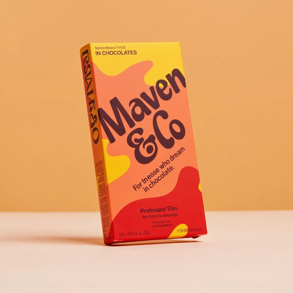
My prompt: "Flat chocolate bar with a bold, high-contrast colour palette, featuring striking shades like mustard yellow, deep red, and warm peach. Oversized, fluid typography dominates the front, creating a dynamic and playful layout. Subtle shadow effects and layered text elements add depth and energy. The design is minimal yet expressive, with clean, structured edges balancing the organic, hand-drawn type. A soft, directional light enhances the matte finish, making the packaging pop."
Why it worked:
- I stated the product format clearly
- I provided specific colours rather than general terms
- I described typography in detail
- I included technical design elements
- I created tension through contrasting elements
- I specified the lighting approach
Aeris
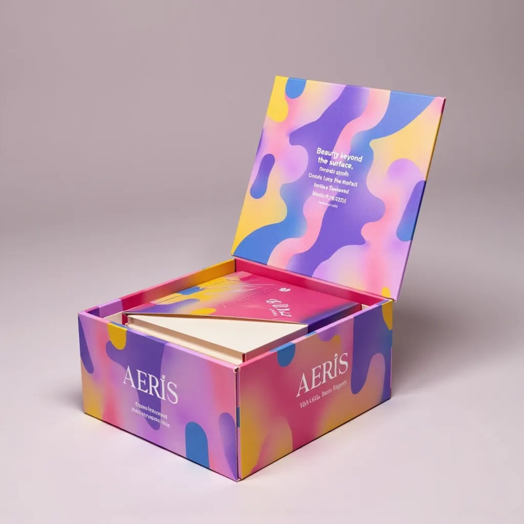
My prompt: "A small structured, lid-style jewellery box with a dynamic, modern aesthetic. The outer surface features lively, colourful illustrations or artistic abstract patterns, wrapping seamlessly around the box. The branding is subtly debossed or printed in a fine minimalist font to keep the focus on the bold design. The pull-tab closure adds a tactile, premium feel, while the interior reveals a pop of colour, creating a sense of playful luxury."
Why it worked:
- I began with clear structure details
- I specified the design style
- I included pattern placement details
- I addressed branding elements and their purpose
- I mentioned functional elements that enhance the experience
- I created a surprise element
- I captured the emotional response
Brim & Bloom
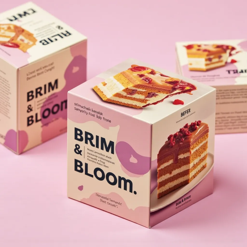
My prompt: "Square cake box with vibrant, high-resolution cake photography, capturing rich textures and indulgent layers. The modern design features bold typography and a clean, structured layout for a contemporary appeal. A refined matte or semi-gloss finish enhances the premium feel, while a harmonious colour palette complements the cake's natural hues. Bright, balanced lighting highlights the packaging details, creating an inviting and mouthwatering presentation."
Why it worked:
- I clearly stated the packaging type
- I specified the visual content type
- I detailed what the photography captures
- I included typography style and layout approach
- I offered finish options with reasoning
- I created colour harmony
- I addressed lighting needs
- I ended with emotional/sensory impact
Common mistakes Leon sees and how to avoid them
Wing: What are some common prompt-writing mistakes you see, and how can our users avoid them?
Leon: After helping many designers get started with Spring, here are the pitfalls I see most often:
Vague language
Weak: "A nice chocolate box with pretty colours"
Strong: "A square chocolate box with a luxurious soft-touch finish featuring a rich burgundy base with gold foil accents"
Contradictory elements
Confusing: "Minimalist design with lots of detailed illustrations and patterns"
Clear: "Minimalist design with a single, strategic detailed illustration"
Omitting critical details
I always tell designers to start with the structure and material as the foundation. Without this, Spring has to guess what you're making.
Unrealistic expectations
Ground your prompts in production realities while pushing creative boundaries. If it can't be manufactured, it's not a useful concept.
Leon's final advice
Wing: Any final words of wisdom for designers just getting started with Spring?
Leon: Prompt writing gets better with practice. Your first attempts may not yield perfect results, but each iteration provides valuable insights. I recommend:
- Start with my formula
- Save your successful prompts as templates
- Experiment with one variable at a time
- Build a prompt library for different packaging types
Most importantly, share your Spring creations with the community. Your experiences help improve the platform and inspire fellow designers.
Ready to transform your packaging design process? Get started with these prompt techniques today and watch your ideas come to life in record time.