14 packaging ideas your customers will love

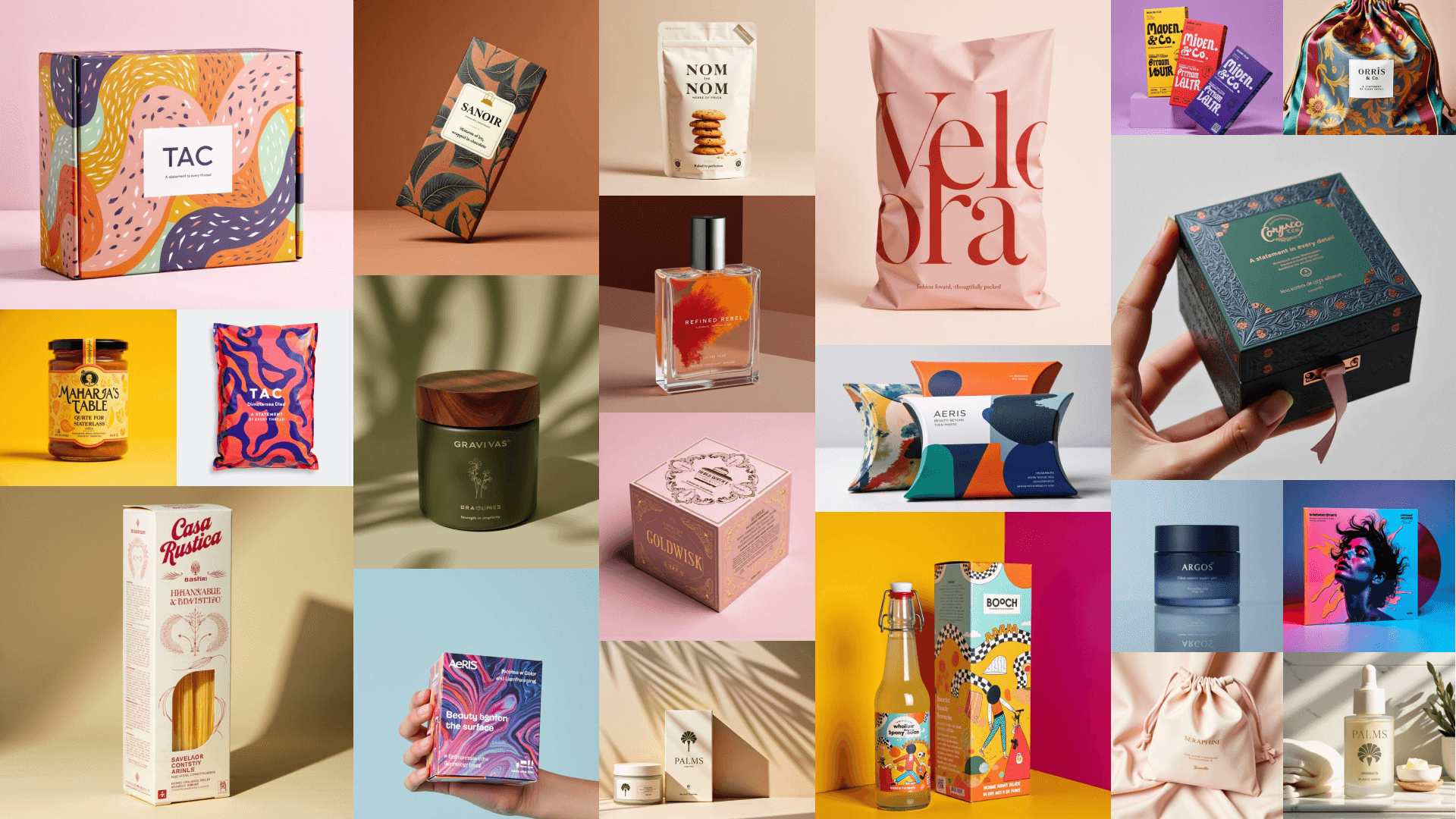
These days, the appeal of your packaging is as important as the product you’re shipping. But it isn't just about aesthetics or popping colours.
It’s a combination of psychology and engaging the senses. It’s a level of personalisation that makes your customer feel understood. It’s being able to say, “we went above and beyond,” to create that memorable unboxing experience.
That’s quite a task. And if you’re not sure where to start, these 15 packaging ideas will kickstart your creativity and take your packaging game to the next level.
- Colour psychology
- Contrasts
- White space
- Natural look
- Themed design
- Branded tape and stickers
- Custom shaped boxes
- Engaging interiors
- Personalised touches
- UV varnish
- Sustainability
- Luxury touches
- Texture
- QR codes
- Interactive packaging
1. Colours: more than meets the eye
In packaging, colour psychology is powerful. In fact, 85% of customers say they’ve bought a product just because of its colours. And your colour choices can also influence how your customers perceive your brand overall.
Take Tiffany & Co. Their trademarked 'Tiffany Blue' box is instantly recognisable. And you know right away that there’s something decadent inside. It’s synonymous with luxury, which enhances their brand appeal.
So, do you want to go for yellow, to be associated with optimism? A calming blue to suggest trust? Or a sleek black to evoke feelings of mystery and exclusivity? You can experiment with an online design studio to help you visualise your packaging until you’ve got it just right.
Ultimately, you want to choose hues and shades that align with your brand personality and your customers’ values. This way, you’ll spark the emotional response you want them to feel when they receive your package.
2. Contrasts: make a bold statement
Contrasts in your packaging design can really make it pop. That’s because contrasting colours are visually engaging. They attract attention and make your brand memorable.
Think of the iconic Coca-Cola red and white combination. It's simple, striking and globally recognised. Or Nike’s tick logo — whether it's white-on-black or black-on-white — it’s unmistakably them.
And that’s what you can do as well. Contrast two colours that symbolise your brand, so when customers see that combination, they think of you. It’s a brilliant way to generate brand awareness and stand out amongst your competitors.
3. White space: the power of minimalism
Filling every part of your packaging with your signature colours or designs can be tempting. But when designing, don't underestimate the power of white space.
White space, or negative space, refers to the unmarked portions of your design. Rather than looking plain, it can provide a clean, uncluttered look that exudes sophistication. Like Apple's minimalist packaging design, which suggests luxury and quality.
And leaving white space does more than make your packaging design look sleek. It also highlights important elements that draw your customer’s eye, like your logo or product name. That way, your messaging won't get lost amongst the noise.
4. The natural look: less is more
With more consumers valuing sustainability and authenticity, going for simplicity in your packaging is a great idea. This might mean opting for earthy colours or keeping design elements minimal. And looks needn’t be deceiving. Because the simple approach usually is truly more sustainable, using recycled, or fewer, materials.
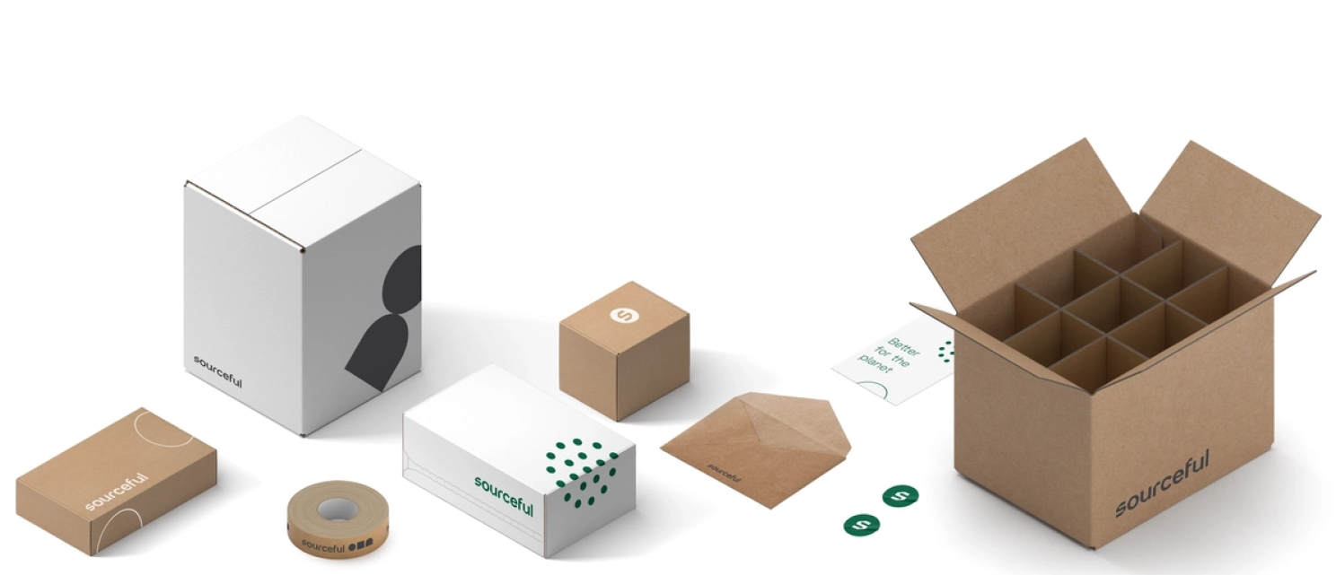
With the range of kraft paper mailer boxes and envelopes available, an unprocessed look is easy to achieve. Simply choose the unbleached version and keep printing to a minimum. Cosmetics brand Aesop is a great example of a striking aesthetic that reflects a commitment to creating quality, botanical products.
Learn more: 18 more eco-friendly and sustainable packaging ideas in 2023
5. Themed designs: ‘tis the season
Designing your packaging around a theme or season can create excitement, as your customers will already be engaged with other seasonal cues. Think festive packaging during the holidays or limited-edition designs celebrating new events like a movie.
Take Starbucks, whose holiday cups have become a cultural phenomenon. Each year, customers eagerly await their release. This is a smart marketing strategy as it drives both brand awareness and customer loyalty.
So, generate a buzz by looking at the year ahead to see if you can capitalise on what’s to come. This way, you’ll appear involved and up-to-date (and probably fun too).
6. Branded tapes and stickers: make your mark
Gone are the days of using tape simply to stick things together. Because now, your tape is another place to delight your customers and make your packaging stand out.
Branded gummed or self-adhesive tapes provide another place for your logo, slogan or signature designs. This helps your brand stay front and centre from the moment your package gets shipped until it's opened. Amazon is a great example of this. You can’t help but think of them when you see a package with their unmistakable branded tape.
And with branded stickers, you can go one step further. Like branded tape, they can hold parts of your packaging in place and boost brand awareness. But you can also give them away as freebies for customers to use however they wish. With branded stickers, you’ll be sure to stay top-of-mind, even when the rest of your packaging has been sent for recycling.
7. Custom shaped boxes: break the mould
Who says packaging should be square or rectangular? Custom shapes let you think outside of the box (pun intended) and can help your product stand out in a sea of conventional packaging. They add a surprise element and show your brand’s creativity.
Think of Toblerone's iconic triangular packaging. It does more than visually separate it from other chocolate bars. The shape makes customers think of far-away mountains, giving them an experience beyond the sugar hit.
Of course, the company has also thought about the logistics of stacking and shipping their product. Triangular prisms fit together pretty neatly, but the same can’t be said for circular boxes. Some shapes will lead to a lot of wasted space and increased shipping costs. So keep this in mind to balance uniqueness with efficiency.
8. Playful interiors: the unboxing experience
Creating a memorable unboxing experience involves more than a striking packaging exterior. Exciting interiors, such as custom-shaped inserts, colours, and decorations, bring your customer a whole new level of engagement and positive feelings.
The beauty brand Glossier, for instance, uses a clean, minimalistic exterior for its packaging. But they surprise customers with a fun, pink interior. The contrast creates a 'wow' moment and makes unboxing special. They also include hidden messages for the customer’s eyes only. It’s as if all the joy of receiving the package is a personal, exclusive secret.
9. Personalised touches: connecting with your customers
In a fast world where mass-production is the norm, personal touches can go a long way. In fact, 54% of consumers buying for the first time say that personalised communication affects whether they’ll buy from that brand again. So how can you personalise your packaging and delight your customers?
For starters, a handwritten note can be really special. Think about it — someone you don’t know has taken the time to write out your name. Wouldn’t that make you feel a connection to them? This is a great, low-cost approach for small brands that are just starting out and have manageable order volumes.
And if you don’t have the resources to handwrite personalised notes, don’t worry. Simply printing your customer’s name on your packaging materials can be effective. Think about how powerful the 2013 Share a Coke campaign was. For many customers, seeing their name on a bottle of Coke was novel and exciting, even if the contents were the same as always!
Personalised communication like this makes the whole buying process more human, enhancing the customer experience.
10. UV varnish: adding texture and luxury
If you think you’ve never seen UV varnish, think again. In fact, think specifically of an Apple product box and imagine running your finger over the apple logo. It feels different to the rest of the packaging, doesn’t it? That’s UV varnish.
This special type of varnish is cured under a UV light, hence the name. It can provide a visually striking and tactile difference to your packaging. And with a high-gloss finish, it gives a premium feel that customers equate with luxury and quality.
11. Luxury touches: elevate your packaging
Adding a touch of luxury to your packaging doesn't have to break the bank. There are plenty of simple yet effective elements you can embellish it with. Like reusable ribbons, tissue paper wrap, or pouches, which can add a sense of exclusivity and refinement. Some also double as added gifts for your customers.
Think back to that Tiffany box with its white ribbon. This thoughtful detail makes the receiving experience more luxurious and personal, and helps build the anticipation of seeing what’s inside.
12. Texture: adding a new dimension
How often have you mindlessly stroked a pet, ran your hands over the grass or sifted sand through your fingers? We humans are tactile creatures, and we love experiencing different textures.
You can create tactile experiences by using embossing or debossing in your packaging design. This sensory engagement adds that extra dimension to your packaging and sets it apart.
This is also important for accessibility. Creating inclusive packaging for visually impaired customers helps them read and enjoy your design. Like Kellogg's, whose braille packaging makes sure that children with eyesight challenges can still engage with it.
13. QR codes: bridging the physical and digital
Whether on your shampoo bottle, your favourite restaurant’s menu, or even your local library wall, QR codes are everywhere. And it’s not a passing trend.
Adding a QR code to your packaging gives your customers a quick and easy way to connect with your brand online. It can lead to exclusive content, special offers or even an augmented reality experience. And at the very least, it helps you save on materials, like promotional leaflets, and keeps your packaging designs uncluttered.
But your QR codes can do more for you than reinforce brand loyalty and promote exclusive content. Like yoghurt manufacturer Yeo Valley, who uses QR codes to educate customers about how they can put “nature first”.
14. Interactive packaging: fun with function
Interactive packaging transforms your package into a functional object or a fun activity. Die-cutting allows you to remove shapes or create specific configurations that will surprise your customers. Have fun with this and let your imagination run wild.
For example, your packaging could turn into a doll's house, a cookie oven, or provide puzzles and games. This not only adds a pleasing element to your packaging but also encourages users to engage with your brand more meaningfully. It’s one of the reasons children (and some adults) love McDonald’s Happy Meals.
Execute your packaging ideas with Sourceful
Whether you’re just starting out or you’re going through a rebrand, creating packaging that’s more than just a 'cardboard box' can seem daunting.
You want it to be memorable, make a solid brand statement, and resonate with your customers on a personal level. And you also need to be thinking about how to make your packaging more sustainable. It's a huge undertaking, especially when every other brand out there is trying to do the same thing.
But there are dozens of ways to stand out and create a connection with your customer. From playing with colour psychology to exploring a natural aesthetic, or creating an interactive unboxing experience.
And that’s where we come in.
At Sourceful, we’ve got the tools, products and the team to support you in your journey towards more sustainable, stylish packaging that’s not just a box, but an experience.
If you’re ready to get started, so are we.
Other articles you might be interested in
Interested in creating the perfect packaging for your brand?
about your printing needs.

.png)


